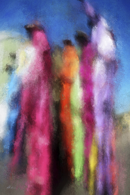
Donald Diddams
The Art of Digital Art
Illumination
Posted on June 14, 2012
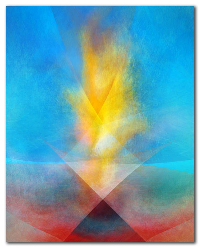
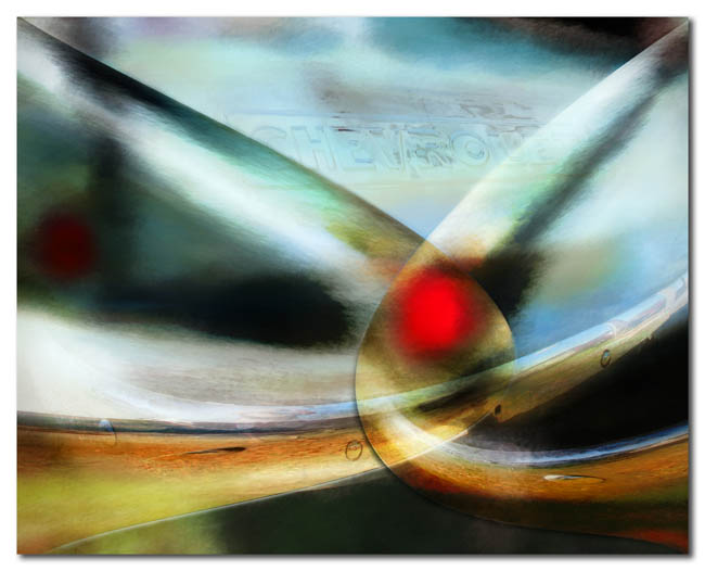
There are many ways of seeing, sometimes with just the eyes, sometimes with the mind, and sometimes even more deeply. And what we see with our eyes may be different from what we see with our mind or our heart.
As with life, art is about finding meaning among the fleeting visions.
Category: A new image, Abstract, Florida, Inspiration, Urban Tagged: chevrolet, illumination, meaning, red dot, torch, vision
Two Feet Down and a Light Dancer
Posted on March 9, 2012
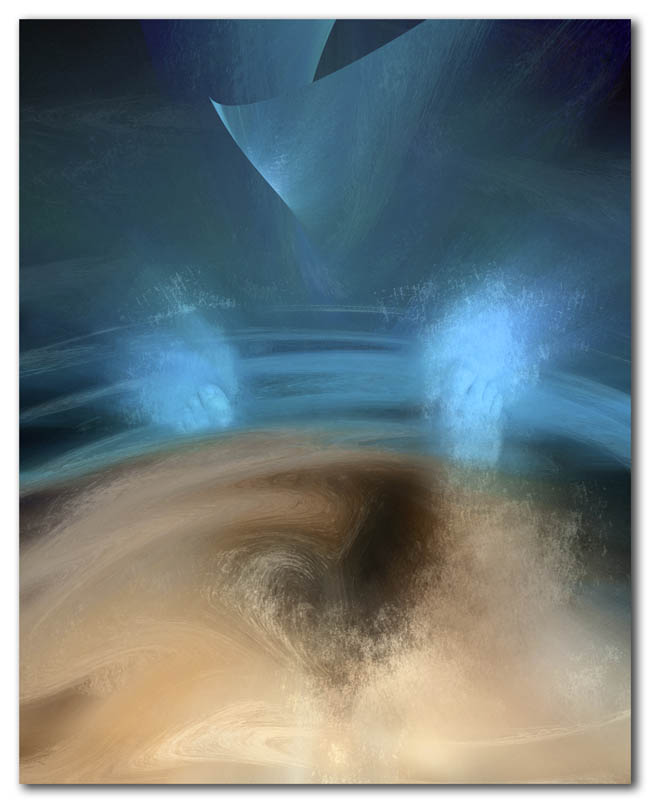
A journey into abstraction is an experiment in using color, value and texture to reach for meaning beyond the literal.
Some art can be enjoyed for the pure pleasure of the color and form. At other times a work can also draw the viewer into the process of finding their own meaning. While both responses are valid, is one more lasting than the other?
Category: A new image, Abstract, Inspiration, Issues for artists Tagged: abstractions, dance, feet, meaning, metaphor
More on “The Kiss”
Posted on May 29, 2011
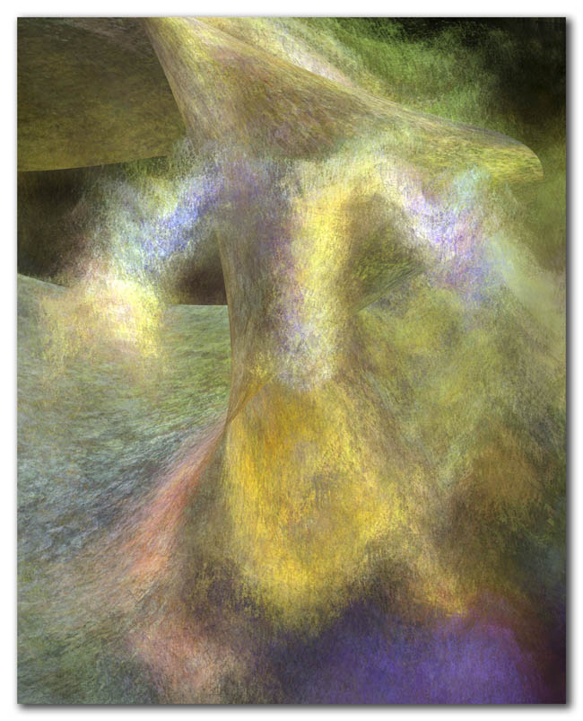
The images here are a more abstract follow-up to the previous post, which focused on the the somewhat controversial “Unconditional Surrender” sculpture by Seward Johnson.
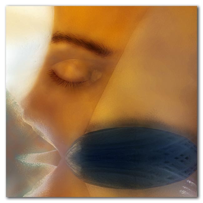
The warm toned image above shows the sailor’s almost feminine closed eye at the moment of the kiss frozen in time. His eye is framed by other elements from the work — elements that suggest some of the strangeness one feels standing beneath this out-of-scale couple, looking up at their embrace.
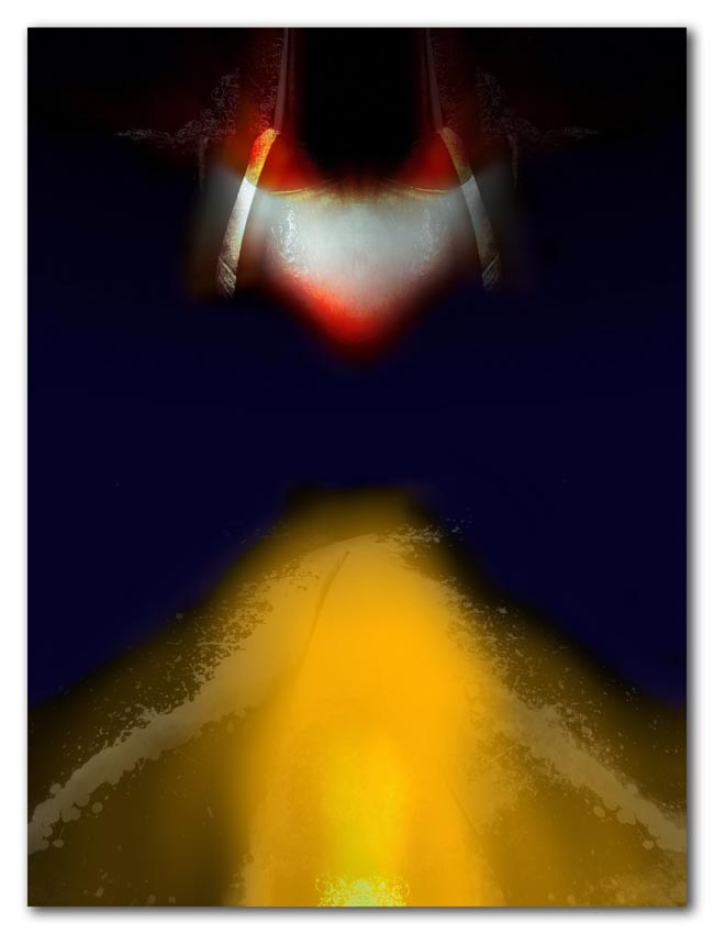
The abstract below was inspired in part by the splash of red paint that had been used to deface the sculpture in what was probably a social statement, and by the emotional triggers being pulled.
Category: A new image, Abstract, Florida, mystery Tagged: abstractions, color, meaning, the kiss, Unconditional Surrender
Subjective Realities
Posted on January 5, 2010
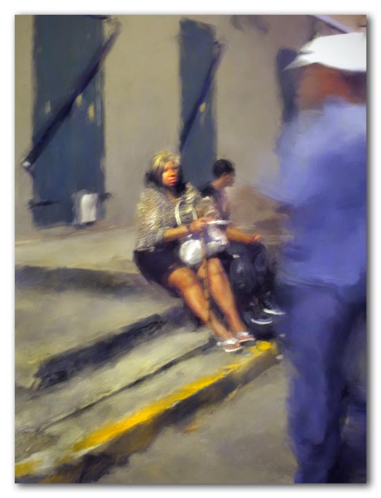
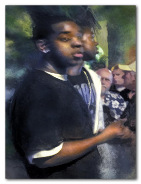
Each person’s heritage and life experiences are different, creating unique subjective realities that affect our interpretation of the world around us. I like these images because the feelings and stories they evoke for me tell me something about myself.
The original images were captured at night, handheld, without the benefit of flash. I then enhanced the indistinct and impressionistic qualities to make the images even less literal, and allow the viewer more freedom to reach their own conclusions.
Category: Inspiration, Issues for artists, mystery, Urban Tagged: caribbean, meaning, metaphor, subjective reality
The Modern Butcher
Posted on October 15, 2009
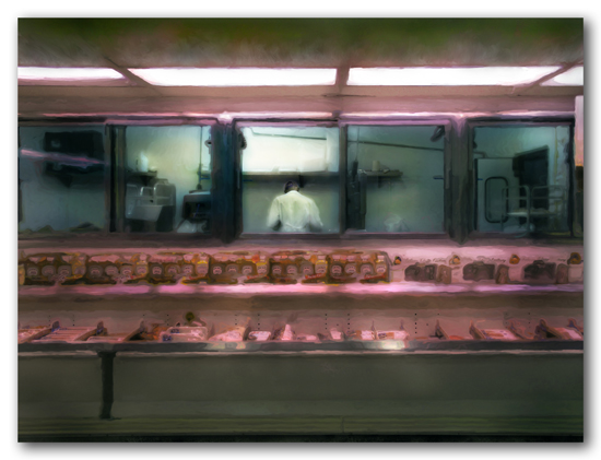
The Butcher - 2009
I was slinking around the local warehouse food store with the camera the other day, and got this moody picture of the butcher, alone in his glass-enclosed cage. The image is a more recent extension of some of the work I did last month in preparation for an exhibit in Frederiksted.
The camera sees the colors of light so much more acutely than the eye. While we all know that retailers make the meat look redder with a little red in the light, it’s normally not so obvious. The two different qualities of light here – in the work room and on the counter – help deliver the message in this image.
The “Daily Strife” exhibit at the Caribbean Museum Center for the Arts opens Friday night, October 16. Six of my images were chosen to be part of the exhibit, including the one on the promotional flyer below. The show will be up until December 1, so stop in if you are on island.

Category: A new image, Inspiration, St. Croix, Urban Tagged: butcher, digital art, food, meaning, meat, modern food, St. Croix
The ubiquitous mobile device
Posted on October 10, 2009
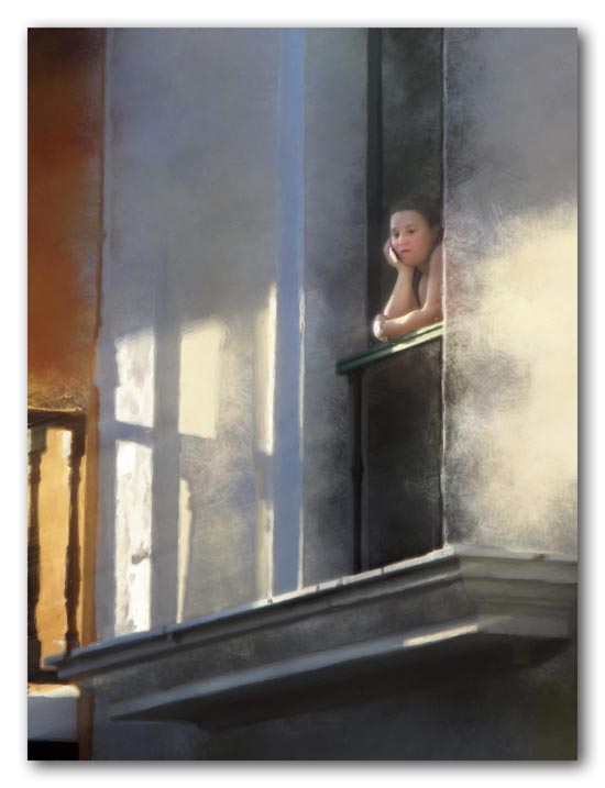
Making Contact - 2009
Mobile devices (what we used to call cell phones) seem to be everywhere and sometimes may isolate us as much as bring us together. The image above from San Juan, Puerto Rico, will be part of an exhibition at the Caribbean Museum Center for the Arts titled “Daily Strife” (opening on October 16). The exhibit commemorates Virgin Islands – Puerto Rico Friendship Day, and its theme is our common experiences and responses to the chaos and rapid change of modern life.
While mulling over the theme of the exhibition, I saw the woman below — a cruise ship tourist — studying her mobile device while walking through the grounds of the historic fort in Frederiksted. She hurried out to where the cannons were placed so she could have her picture taken with the ship in the background. I wondered if she even saw the fort.
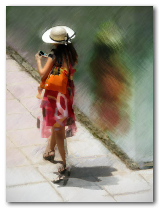
Doppelganger - 2009
Category: A new image, Inspiration, Issues for artists, Urban Tagged: caribbean, digital art, doppelganger, Frederiksted, meaning, mobile device, San Juan, St. Croix
A Mango-Tangle of Colors
Posted on August 12, 2009
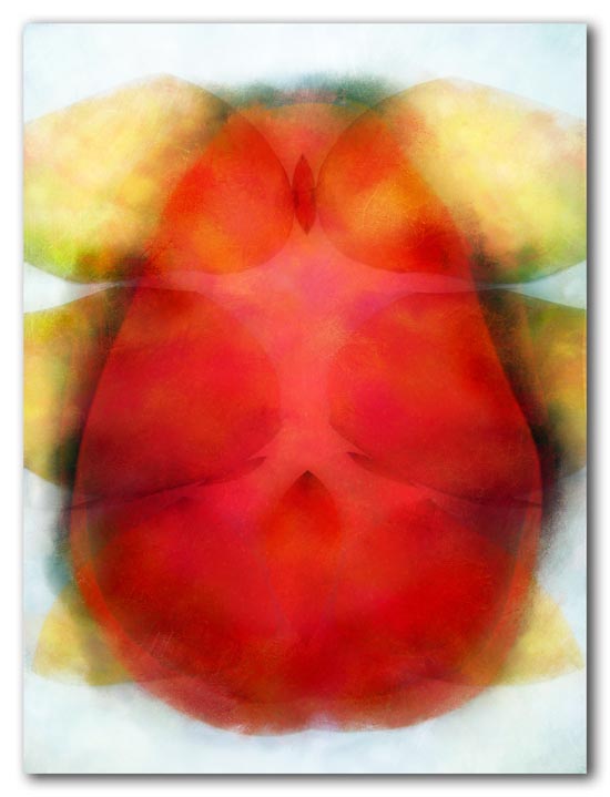
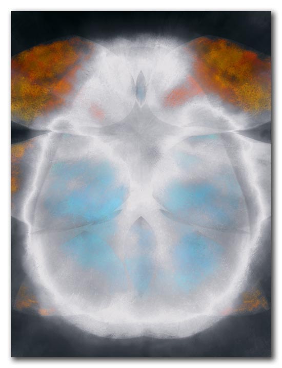
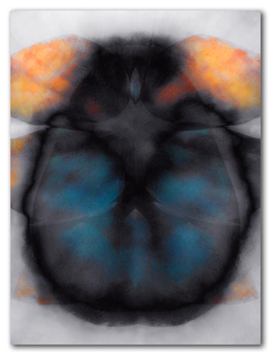
The abstract images below started as photographs of one large mango and six small ones.
The first image is more or less the original mango colors. Stored sunshine. The other two emerged as I was working with the image. For me — even though there is little or no content to the images — they each evoke a different reaction and different feelings. While I have a favorite, looking at the three together raises a question.
“I like art that makes me smile,” I’ve been told. Many people do, and many also don’t like — and don’t respond to — art that evokes less positive emotions. But does that make it any less valid?
Mango 1
Mango 2
Mango 3
Category: A new image, Abstract, Issues for artists, Still life Tagged: abstractions, dark image, digital art, happy art, meaning
Outfall
Posted on August 6, 2009
Outfall - 2009
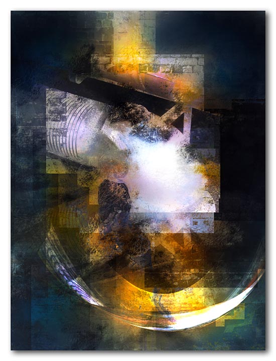
This image started as an abstract, but somehow also became a reflection on our culture and economy. It is interesting how the colors, the grid-like overlays, and the shapes contribute to an ambiguity of meaning that the imagery of the pipe and wall alone could not carry.
Category: A new image, Abstract, Environmental issues, history Tagged: abstractions, digital art, environment, history, meaning, metaphor
Beyond the Green Door
Posted on June 11, 2009
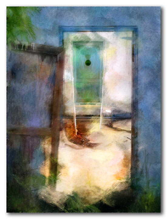
Beyond the Green Door - 2009
This is from the same series as the “Window to the Past” in the previous post. Here the brightly lit interior space draws the viewer in toward the green door with the little round window. It looks dark through there. I wonder what is on the other side?
Category: A new image, history, Inspiration, St. Croix Tagged: caribbean, digital art, door, meaning, ruins, St. Croix
Window to the Past
Posted on June 6, 2009

Abandoned - 2009
This window in an abandoned hurricane blow-out looked in on a tiled shower stall, with a green curtain still hanging — all lit from above through the missing roof. It is a strange feeling to come across these not-so-old ruins with reminders of the lives lived there still blowing in the breeze while the vines grow in.
Category: A new image, history, Inspiration, St. Croix Tagged: caribbean, history, hurricane, meaning, reminders, St. Croix
Rum Factory Pot Still
Posted on May 20, 2009

Pot Still - 2009
This is an old pot still used in the making of rum back in the nineteeth century. With its strange gooseneck this is a somewhat unusual-looking relic of the sugar-based argibusiness of the Caribbean’s past. The image is dark and muddy to reflect my feelings about that past and some of its effects on people that continue to be passed down through the generations, even today.
For a gorgeous oil painting of an ancient sugar mill, and a description of things that took place there, check the May 20th post from Bonnie Luria, St. Croix painter and fellow blogger. Honestly, we didn’t conspire to address the same subject on the same day!
Category: A new image, history, St. Croix Tagged: dark image, digital art, history, meaning, rum, St. Croix, sugar plantation
Locked Out/In
Posted on March 15, 2009

Locked Out/In - 2009
The ambiguity of a locked door… Which side is out and which in? Am I locked out to protect what is in, or locked into my world. Or is what is on the other side locked out to protect and keep safe what is on this side? There must be something important behind that door, but I’m not sure I want to let it out… or to get in. Do you?
Category: A new image, Abstract, Inspiration, St. Croix Tagged: caribbean, locked door, meaning, metaphor, surprise
