Donald Diddams
The Art of Digital Art
Almost abstract
Posted on February 6, 2010
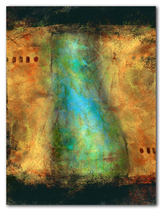
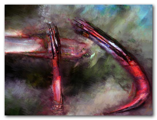
These two almost-abstracts are a little change of pace. The first started as a door in a yellow stucco wall, and the second as a broken guardrail near one of my favorite beaches. But those reference points are largely irrelevant now.
It is interesting how non-representational art can demand both more and less of the viewer. Abstracts have the potential to become eye-candy — color, composition and textures to please the eye, without any representational component from which to draw meaning.
However, even without an external reference point, some abstract art evokes feelings and reactions, and forces the viewer to find meaning in it. It is a mystery to me how to accomplish that on a consistent basis, and to make abstract images more accessible and understandable beyond their appeal of color and form.
Category: A new image, Abstract, Caribbean colors, Issues for artists, St. Croix Tagged: abstractions, Boiler Bay, bulge, gold, guardrail
Bottled Sunlight Mixed with a Gentle Rain
Posted on September 7, 2009

Grapefruit - 2009
Every July the local botanical garden sponsors the “Mango Melee” — a county fair-like event featuring dozens of varieties of local mangoes and other locally grown tropical fruit. This little pile of grapefruit was accented with one pink and one yellow fruit cut open to display the richly colored and textured interiors. If you could bottle sunlight mixed with a gentle rain, it might look like this.
Category: A new image, Abstract, St. Croix, Still life Tagged: abstractions, bottled sunlight, caribbean, digital art, grapefruit, mango, Still life, tropical fruit
A Mango-Tangle of Colors
Posted on August 12, 2009
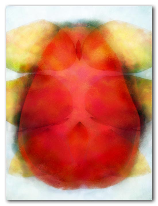
The abstract images below started as photographs of one large mango and six small ones.
The first image is more or less the original mango colors. Stored sunshine. The other two emerged as I was working with the image. For me — even though there is little or no content to the images — they each evoke a different reaction and different feelings. While I have a favorite, looking at the three together raises a question.
“I like art that makes me smile,” I’ve been told. Many people do, and many also don’t like — and don’t respond to — art that evokes less positive emotions. But does that make it any less valid?
Mango 1
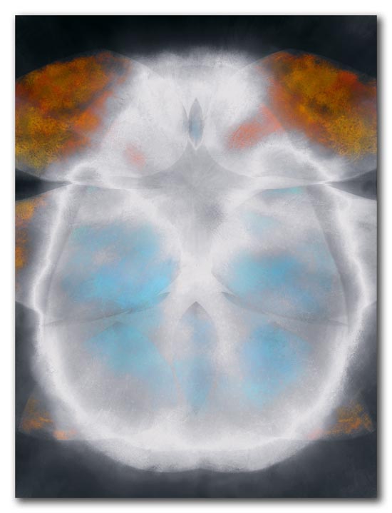
Mango 2
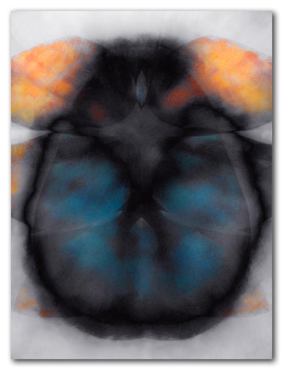
Mango 3
Category: A new image, Abstract, Issues for artists, Still life Tagged: abstractions, dark image, digital art, happy art, meaning
Outfall
Posted on August 6, 2009
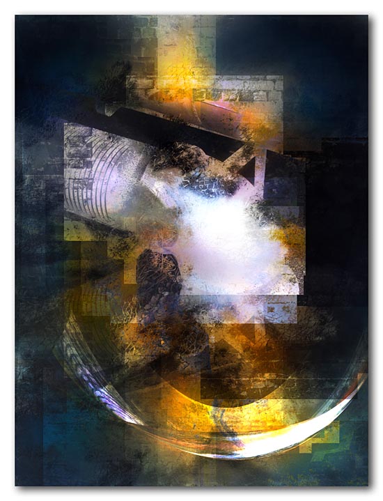
Outfall - 2009
This image started as an abstract, but somehow also became a reflection on our culture and economy. It is interesting how the colors, the grid-like overlays, and the shapes contribute to an ambiguity of meaning that the imagery of the pipe and wall alone could not carry.
Category: A new image, Abstract, Environmental issues, history Tagged: abstractions, digital art, environment, history, meaning, metaphor
Upheaval at the shore
Posted on July 9, 2009
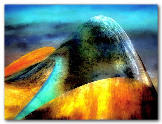
Upheaval at the shore - 2009
While walking along the beach, the blue waves of the Caribbean Sea were in sharp contrast to the sunlit golden sand, coral stone and little black sea urchins at my feet. Suddenly, the warm tones of the sand and stone just under the water’s edge burst out, threatening to tear the very fabric of the sea… I wonder if that happens every day.
Category: A new image, Caribbean colors, Inspiration, Still life Tagged: abstractions, beach, caribbean, digital art, environment, shoreline
The Baths at Wills Bay
Posted on June 26, 2009
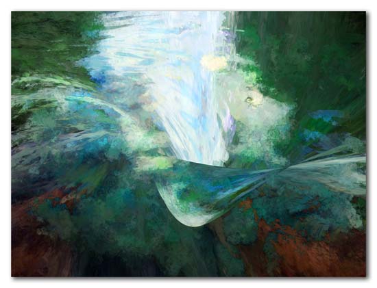
The Baths at Wills Bay - 2009
The “baths” at remote Wills Bay on the northwest shore of St. Croix is essentially a large tidepool set among sharp jagged rocks. The water is clear and green and is refreshed periodically when a large ocean swell crashes into the rock barrier and splashes over into the pool. It’s a bit of a struggle to get there (unless you hire a jeep and guide), but is one of the magical spots on the island.
Category: A new image, Abstract, Caribbean colors, St. Croix Tagged: abstractions, baths, caribbean, digital art, ocean, shoreline, St. Croix
Primarily Abstract
Posted on June 17, 2009
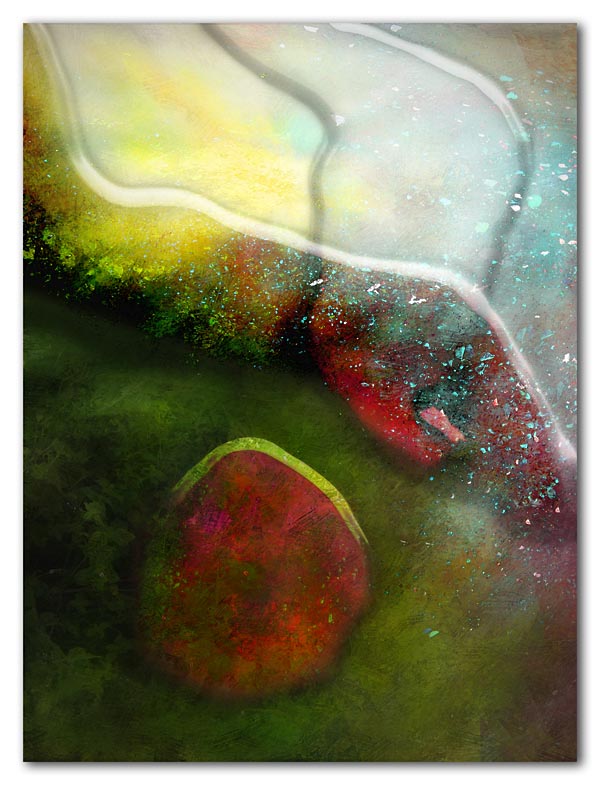
Primarily Abstract - 2009
This image started as a photograph of some reddish-brown vines, green weeds, bright yellow/green paint spilled on the broken pavement, and shattered blue glass scattered across the area. I was attracted by the color fields and the texture of the blue glass.
Unfortunately, the areas of color were not clearly defined by a change in values and the scene was flat, despite the colors. This abstract is the result of my experimentation to find a solution and “save” what was interesting about the original scene.
Category: A new image, Abstract, Inspiration Tagged: abstractions, art styles, digital art, glass, primary
Just Color!
Posted on May 22, 2009
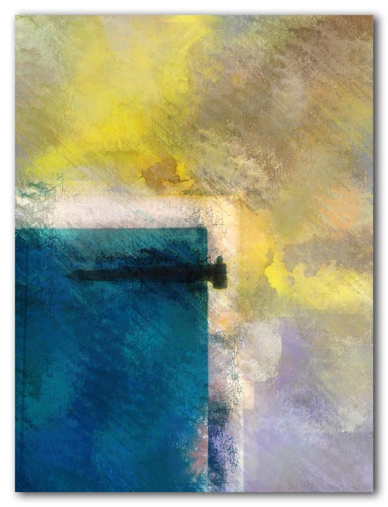
Wood Shutter and Wall - 2009
An old wood shutter, black iron hinge and peeling paint on the stucco wall provided the raw material. These peeling and crumbling tropical facades are the subject of thousands of photos by tourists and pros alike. Still, I can’t resist adding just one more to the pile.
Category: A new image, Abstract, Caribbean colors, history, St. Croix Tagged: abstractions, caribbean, color, digital art, Still life
Rusty Bolt on Yellow Plank
Posted on May 11, 2009
This image is from a parking barrier constructed of a heavy yellow plank bolted to two large posts. This bolt was well into its rusty phase, with rust stains spilling down below it. The plank itself was faded with dings and chips and peeling paint.
This was the raw material for the abstract study in texture and color below. As with many images on the web, some of the color and textural detail from the full-size original has been lost.
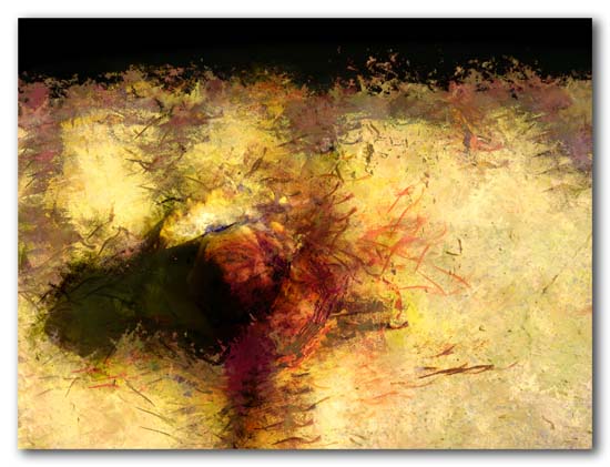
Rusty Bolt on Yellow Plank - 2009
Category: A new image, Abstract Tagged: abstractions, digital art, texture
Point Udall View to Buck Island
Posted on May 8, 2009
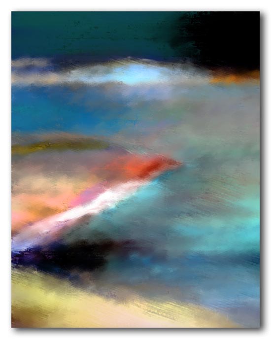
Buck Island View from Point Udall - 2009
Local tourism brochures advertise Point Udall on St. Croix as the easternmost point in the United States. The park and monument on Point Udall are on a high hill. This view looks back to the northwest along St. Croix’s north shore toward the iconic Buck Island in the distance. Although abstracted into a study in shape and color, the glowing attraction of the offshore landmark is still recognizable.
Category: A new image, Abstract, Caribbean colors, St. Croix Tagged: abstractions, buck island, caribbean, digital art, ocean, shoreline, St. Croix
The Changing Room
Posted on April 30, 2009
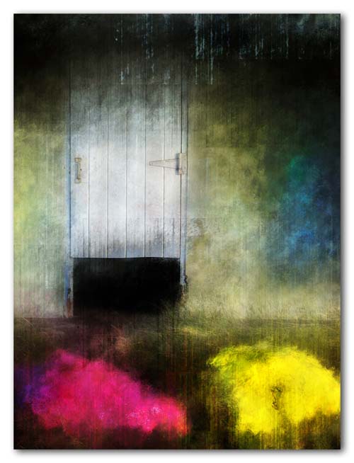
The changing room - 2009
This image came from a little park on the beach nearby. There is a small building with changing rooms for swimmers, and a number of large rocks and boulders that have been painted bright pink, yellow and purple. The half door, the colored boulders and the play of the shadows under the eaves in the early morning light led to this abstraction.
Category: A new image, Abstract, Caribbean colors, St. Croix Tagged: abstractions, beach, caribbean, digital art, locked door, pink, shoreline
Carambola Dream
Posted on March 9, 2009
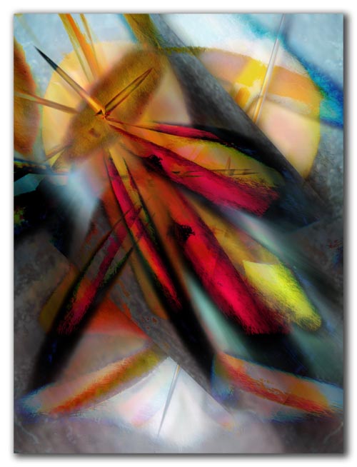
Carambola Dream (2009)
Believe it or not, this too started out as a picture of a carambola — a single fruit on a marble slab.
But it is still there — its gentle curves and angular shapes, ripeness, tartness, splinters of color reflected and from within, and the smooth leathery feel of its skin.
Category: Abstract, Caribbean colors, Still life, Tropical plants Tagged: abstractions, carambola, digital art, Still life, tropical fruit
