Donald Diddams
The Art of Digital Art
Tension and Context
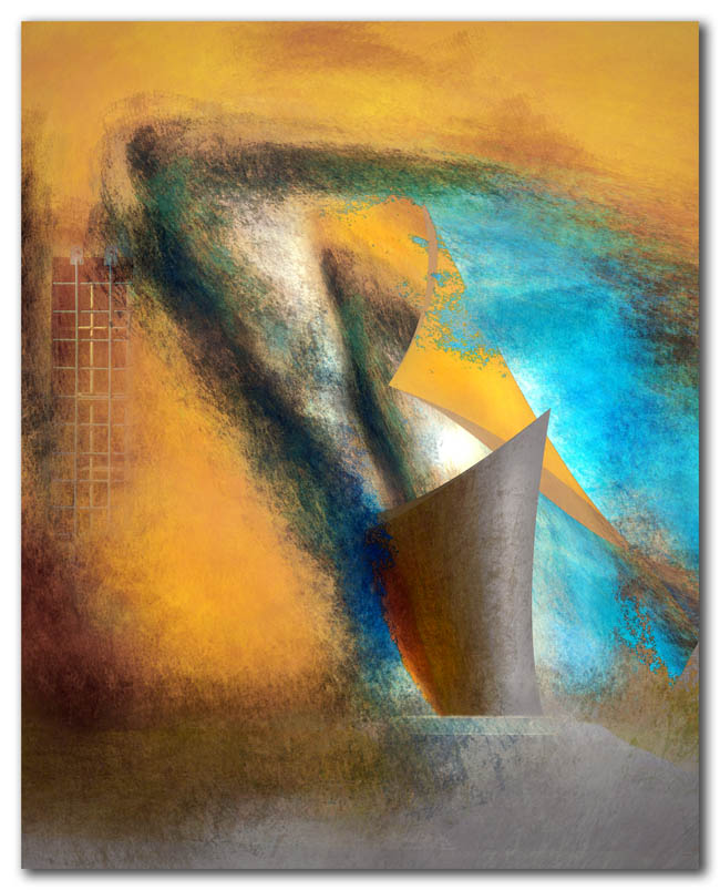
The little building had a single door with a turquoise frame and a narrow barred window. A few of those details provide tension and context for a reflection on this small piece of the urban landscape.
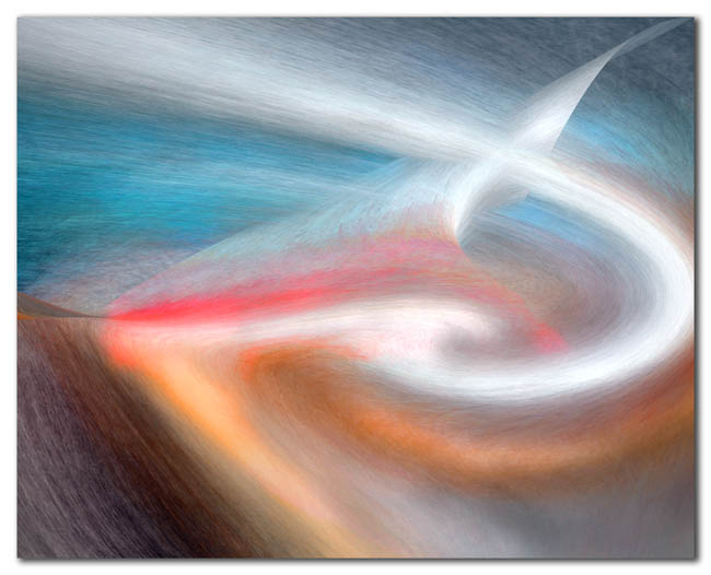
In contrast, “Hooked”, below, is purely a landscape of the mind, with no detail left to link it to reality. That level of abstraction is disturbing to some, but does it make the sense of being hooked any less real?


I adore these colors Don – were they on your palette before Florida?
Beautiful colors the top one so rich, I also really like the narrow barred window to the left. On the bottom one my mind wants to float up and out with the ribbon to see where it may be going.
Thanks Moe! Interesting question… I moved to FL from the Caribbean, and if anything, the colors there were more vibrant and somehow “different.” I think it had to do with the quality of the light on an island even nearer the equator and surrounded by that brilliant blue sea. Each place really does have it’s own palette, and it sort of seeps into the art whether you want it to or not. So these I would have to admit these colors are more Florida than caribbean.
Thank you, Starla! Those colors sure are different than the colors from the north country this time of year, aren’t they? More like golden aspen leaves on a clear October afternoon.
Don – re the colors in our environment here: a pet peeve of mine is the endless use of ‘Mediteranean’ color schemes. They read entirely wrong to me. The light in the Med is golden and those earth tones glow, which is gorgeous. But here, in our pure white light, and those brownish, beige buildngs just look dirty. I’d like to see more of those Caribbean colors or Bermuda colors. But sadly, that’s not likely to happen. Turquoise! Yellow! PInk!
These are wonderful abstractions. I feel like there is a suggestion of a vortex lingering at the door. Hmmm. Some interesting energy.
The second one is very good because it is from your own imagination–pure.
I agree with the discussion here: Color really is affected by environment and culture. Are we looking for contrast? Balance?
Thank you, Melinda. I like that little swirl of energy by the front door, like a dust devil. It’s interesting, speaking of color and environment, when I saw this building I thought of you and the desert southwest. It’s colors reminded me of what one might see there.
You mention culture, too, affecting the palette. It does. So what does it say about suburban America that miles and miles of homes are some variation of taupe?
It suggests, to me anyway, that American society has lost its sense of aesthetic, relegated its spirit to a prison-like environment where color is dangerous, rebellious, too individualistic. There is a fear based timidity in home after home filled to the brim with beige.
Depressing.
In my neighborhood, one house south of me is painted a creamy yellow (in the golden hour turns a very pale light green), that has a raspberry side wall and a bright lime green border wall. Trims are different colors too. Then, to the west of me, there is a rental that is painted purple. My home is golden with the red studio and different trim colors. The Doubletree Hotel just north of me copied our colors a few years ago. Funny thing. They added some trim colors too (to be like us), not knowing that we hadn’t finished the trim!
Okay, I ramble. But, it’s very disturbing when people live in such drabness. Doesn’t it make them sad?!
This must have hit a nerve, Melinda. I agree with every word. I think the developers and sales people insist on bland to avoid “offending” potential clients. So everyone begins to think it’s what’s in style.
Funny thing is, it is often the neighborhoods (often older inner-city neighborhoods) where creativity and boldness have taken hold that are now considered most vital, most desirable, and most valuable.
I congratulate you on being a “color leader” in your own neighborhood! (Not surprising, I guess…)
Always a treat to catch up on your intriguing posts and mind boggling images…..particularly like this abstract series! You certainly have the artists eye for color , form and division of space!…nice work Don!
Hi Robin! Thanks so much. Always nice to receive a vote of confidence!
I like what I like … and I like these.
Reality be damned!
Thanks planetross! Who ever said reality was real anyway?