Donald Diddams
The Art of Digital Art
“Your New York”

This Is Your New York -- 2009
Here’s a snapshot of life in New York City. I’ve made a point of finally working through a folder of pictures taken last year, and have posted a few finished images on my portfolio website. Please have a look!
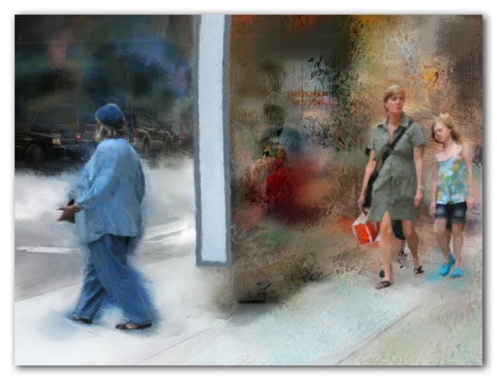
This otherwise ordinary city street/sidewalk scene intrigued me because of the way the edge of the bus shelter so dramatically bisected the frame leaving the happy shoppers on one side, and the person in denim with the traffic on the other. Behind the glass of the shelter (a little hard to see in this tiny size) are two murky figures and the poster that says “This Is Your New York”. A city of divergent moods – all at once.
Update
After Bonnie Luria’s comment (see below) got me thinking, I reworked this a little by adding some of the sidewalk and curb lines and colors from the original. I think the change helps unify the two halves of the image, and now the light values of the sidewalk add an important diagonal design element to the composition. Thanks for planting the seed, Bonnie!

This Is Your New York (revised) - 2009
The image also to point to the very differnt worlds people can live in whilst being so near.
Great juxtaposition of souls separated by just a few feet, yet completely anonymous to each other.
Strange too, how the figure on the left appears dressed for snow shoveling while the mother and daughter are in summer clothes.
So they’re also separated by seasons, all in the same frame.
I’m guessing you’d have hundreds of images to plow through from that trip.
Razzbuffnik, comments even while travelling! Yes, different worlds. I think that is most obvious in cities where people are in close physical proxoimity yet different universes in terms of their experience of life.
Bonnie, many images indeed, but unfortunately many cliches and only a few worth following up on. Maybe time to go back!? I hadn’t focused on the clothing difference… it was a pleasant summer afternoon, warm enough for shorts, but cool enough for long pants.
Your observation stimulated a self-critique: this image almost looks like a clumsy composite designed to make a point. Although I assure you it is not a composite, I can see now how it would benefit from some additional elements from the original (perhaps along the curb or sidewalk) to tie the two sides together more. I may play with that some — it’s all about learning. Thanks!!
Very cool!
I don’t see any thing weird or rorschach test material here.
Thanks, planetross! I’ll really try to get more rorschach material for you here later. It’s so much fun!
I just visited your portfolio. I love those two street scenes. Love them, I tell ya’.
Hey, thank you, Pat! I had a good time working on those; something a little different than my usual.
This is SO cool and slightly surreal, the way the background is unfocused and the focused people are emerging from it. Super cool!!
Thank you Jala! The style and colors on these urban scenes from NYC is different from what I’ve used on the source material here in the Caribbean. I guess that shouldn’t be a surprise really… but still, it wasn’t a conscious decision.