Donald Diddams
The Art of Digital Art
The Color Orange
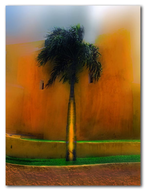
Orange, the color of sunsets, mangos, and the aptly named orange. Every once in a while — and for a reason I cannot discern — I seem to focus on a specific color. This was orange’s turn.
The subjects here were ordinary — a lone palm silhouetted against the fort wall, and the historic Christiansted church cloaked in orange canvas to rid it of termites. But in each case the application of color and light transforms these prosaic subjects into something more.


Wow, these are amazing!! The lower one particularly.
Some of your digital paintings are reminiscent of a detail of a turner or a Blake (both of whom are quite different from each other but who have a certain similarity in intensity and, sometimes, colour).
Oooooh, these are vibrant and strong and wonderful! For a long time I didn’t like orange. I like it now and you did it proud.
I can see Whoopi Goldberg in this sequel. hee hee!
Orange is so in your face: it’s saying look at me!! look at me!! … but sometimes you want to look at it. Very nice.
The singularity of the palm and the intensity of the colors, make this a very powerful image. The green provides a nice resting place for the eye.
Beautifully done.
And, the second image has great composition and energy. Very thought provoking.
The second images is so bright it reminds me of a lighthouse or angelic in nature. Just amazing, I like the dark and light clouds at the top as well. The second images beautiful as well, I also like the green at the bottom.
Thanks, Val! It’s hard to avoid intensity with the color orange!
Hi, Carol. Like you, for a long time orange was not one of my favorites, but I’ve recently sort of latched onto it. Thanks!
Hey, planetross! And the sequel to the sequel… The colors orange and purple live together. Now there’s a vibrant combination! Thanks!
Thanks, Melinda. That vibrant green strip of grass in the first image is part of what inspired it, along with that lone palm. Glad I could provoke a few thoughts! Thanks!
Thanks Starla! You never know what ones imagination can do with a building tented for termites. You’re right about the spiritual implications.
I love the discordant colour of the first image. As you already know, I’m a real sucker for such bold colour schemes.
Who would have known, razzbuffnik, how well that golden orange and bright green with a touch of pale blue in the corner would do together? I wouldn’t have believed it if I hadn’t seen it. Thanks!
This second image is terrifying. I feel like I’m a capsized woman-overboard swimmer, and this enormous tanker is bearing down on me and there’s no escape.
Oh wow, Jala… an old church turns onto a tanker. But then, religious zealotry can be like that — a tanker bearing down — so I guess you are not far off! Thanks!