Donald Diddams
The Art of Digital Art
A Modern Shrine
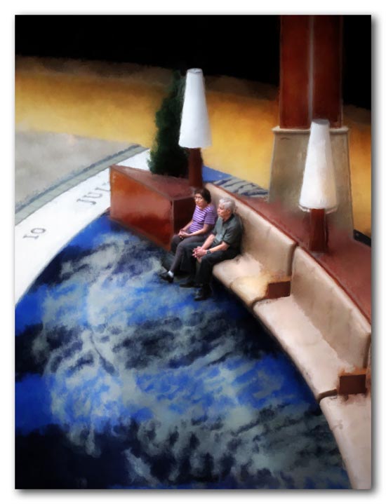
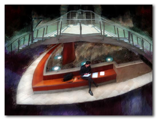
There is a new shopping mall near the airport in Orlando, Florida. It is called Mall at Millenia and is a part of a much larger mixed use (retail-residential) development called simply, and somewhat ominously, Millenia. These images are from the mall’s interior public spaces dedicated to the further glory of upscale consumption.
For a moment I had a vision of this magnificent public space as a shrine to human creativity instead of consumption, surrounded by galleries, performance spaces, reading rooms, and classrooms for the advancement of creative human endeavors. If only those were our cultural priorities… silly me. Rarely have I felt the tension between the possibilities and the realities of a place so strongly.


Some places have no internal enlightening systems: just fluorescent stuff.
It’s not very renewable.
i could relax so much in there.
Thanks for your comment on my blog, Don. I’m delighted to discover your blog and amazed I haven’t run across it before. Your work is beautiful–moody and conceptually rich, as well as rich in design and color…a treat for the eye and mind.
Thanks, gentlemen!
Planetross- your comment about the lack of internal enlightening systems is so perfect! A real giggle, and right on the mark, too.
kseverny, thanks so much for visiting! On a quiet morning a nice nap on one of those benches would be great. i wonder if it would be allowed… Truly great interior design. I now have a new blog to peruse (yours), complete with imaginative designer desserts!
Don Gray, thanks so much for checking me out, and for the fine compliments!
These are very cool looking and I’m wondering (is that wrong?) whether they really look like this or how far you went in your dream state? I know, I know…artist’s whimsy rules and all that, BUT you did anchor it in a real spot and I’d like to see it. I’ll leave now.
Pat, … inquiring minds want to know? Of course I “fixed things up” a bit, but really the interior design and use of surface materials in this place were very well done. I changed very little in the top one except eliminate some distracting detail and give it better light. On the bottom one, I did a bit of remodeling on the stairway, of course, and a few other things. You’ll see…
Very futuristic looking. The people are dwarfed by their surroundings and seem so detached and separate. Love the colors in “A scribe”. The deep blue and red diminish into the faded green…a staircase that goes no where. What a wonderful idea to use the space for human creativity, but as the saying goes, “You can’t play the blues in an air conditioned room”.
It looks so isolating.
It’s almost like the people have been quarantined on little artificial islands at Disneyworld.
Catherine, thanks for your astute reading of these. I like the way everything seems to float in “The Scribe”, too. The architecture and design here were very suburban in that they reinforce the separateness.
Razzbuffnik, you and Catherine are on the same track here. This wasn’t Disneyworld, but close to it — in distance and energy! The scale of the space and design of seating were isolating.
This is the first time I’ve seen your unique style put to use on a modern indoor space. I think it works great! You should do this more often.
Photos4u2c, welcome back! Thanks for the input. I will be doing a little more urban type work, but “modern interior space” is something hard to come by her in St. Croix!
Nice to be back on your site! Some great stuff here. I particularly love the guy in purple one and especially the red steel band one–they look to me like paintings. !
Happy New Year, jumbie-free.
Welcome back Jala! Thanks for your comments… hope your new Year is a good one!