Donald Diddams
The Art of Digital Art
Primarily Yellow
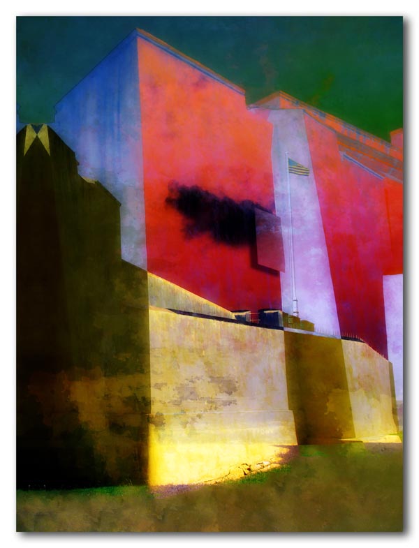
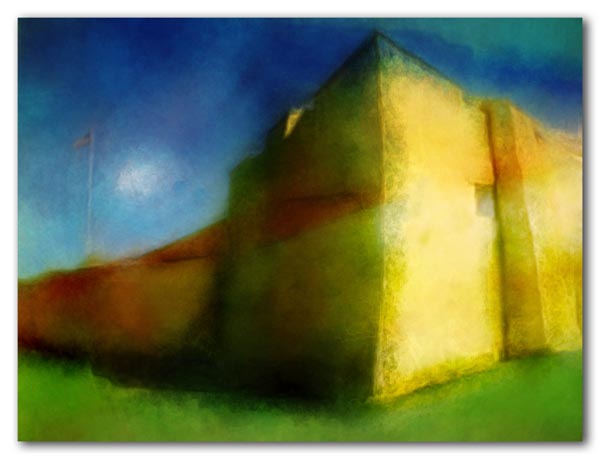
They are painting Fort Christiansvaern. No, not red; that was me that did that. But yellow, that wonderful golden yellow that one sees on so many of the historic buildings in old Christiansted. The paint and repairs are important to protect the structure, and historical correctness is being observed. Still, the crumbling walls and peeling paint give the fort some of its character.
The fort is unendingly photogenic as its shapes, angles and colors shift perceptibly as the sun moves across the sky — as if it were a giant work of art set beside the sea. Despite the shape-shifting beauty of the building, I have darker feelings about its original purpose and things that happened there so many years ago.
These images are two interpretations of the same original photograph. Perhaps they reflect some of my ambivalence.


Whilst I like both images, I prefer the top one.
Come to think about it, in general I prefer your more abstract images. Then again, that image of that old car rear end with the fins still sticks in my mind as some thing I’d like to own.
Thanks, razzbuffnik! The top image is more complex, but somewhat static, while the bottom is simpler, but more fluid and dynamic. An interesting pair. The car was a 1961 Plymouth. Those were the days… One of my favorites from the era was the 1959 Chevrolet 2-door hardtop. Great swooping fins and teardrop tailights. Google it and you’ll see what I mean. I had one back in the late 60’s when gas was still 25 cents a gallon!
Hmmm. These two images are so expressive of two very different perspectives/moods/statements. I’m enjoying the power of the first and the gossamer-like feel of the second.
I think you have achieved your idea of these as “shape-shifting beauty.” Well said!
Beautiful work, really stunning.
If I had a fort, it would be called “ross”: … fortross! hee hee!
I only have a tree and a bit of lumber so far though.
Thank you, Melinda! These were done at different times, so I didn’t realize at first that these came from the same original photo until I was posting them. A surprise!
“Fortross”, planetross? So would that be to protect your planet, ross? Thanks for visiting!
Someday everyone will discuss your Yellow period.
Very nice.
Powerful and strong images, the first one seem like it is so tall it could touch the stars.
Ha! Funny, Jala! It came just after the blue period… Thanks!!
Thanks, starlaschat! It does have that perspective you get looking up, doesn’t it?
From a purely visual point of view, I prefer the first one and the abstract quality. It is strong bold and fortress like. On closer look, the somber sky, sanguine colored walls and moody darks almost overshadow the “sunny” yellow. But bright yellow always does its job, leading the eye to all the warm bits in the image. Which is what the lovely yellow must do for tourists who don’t want to be reminded of past history.
The second image makes me want to sit on the grass and have a sandwich and coffee :)
You’ve said it well, Catherine… The picnic allusion makes me think the top one is like steak with a good cabernet, while the bottom is more like pinot grigio for lunch! Thanks!!