Donald Diddams
The Art of Digital Art
The Dark and Light of it
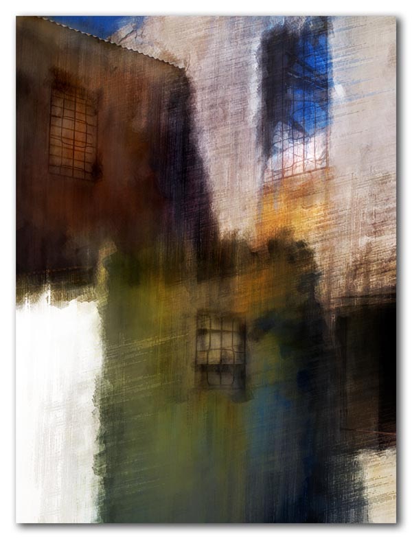
The strong shadows from the morning sunlight highlighted the geometry of this cotton plantation greathouse that lay in ruins — windows missing, iron bars staining the walls with rust, and the roof open to the brilliant blue morning sky. These old stone relics are gradually disappearing as they crumble or are converted into modern greathouses for today’s wealthy.
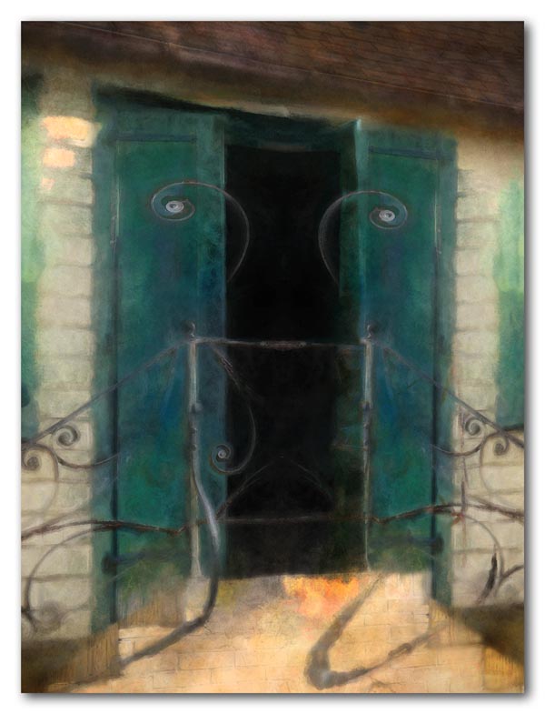
On the “lighter” side is this second floor doorway in a historic Christiansted building, apparently still occupied. The stairway, green doors flung open, and delicate curves of the railing invites one in.


They are both beautiful Donald, I would LOVE to have something like these framed and hanging on my living room wall. Gorgeous!
Good strong design and love your choices for color and subject.
Hi sweetiegirlz! Thanks so much! These were both fun to work on, partly because I wasn’t sure where they were headed when I started.
Doorway with feelers I like that title the gentle sweeping rails, just beautiful and the colors are great. Wow, and the first one turning ruins into Art, both are my new favorites.
Thanks, starlaschat! It’s nice to find new favorites every once in a while!
such finely crafted textures. they are different in the two pieces, while they share a kind of sensibility that creates a feeling in their statement. that feeling is that thing, not certain, that recognizes and knows a place, but is able to see it as brand new every time. these are two extraordinarily gorgeous paintings.
I really like the “watercolor” feel of these images. The subtle washes allow the textures to come through: the stone with grated windows and the siding and doors on picture #2. The strong dark and light values are very striking and I love the touches of warm orange/yellow in both images that give the sense of sunlight. These are quite gorgeous and I can imagine them hanging as a pair on some lucky person’s wall.
tipota, as always your words say it so well. These are related by place and history, yet so different in their texture and initial appearance. That happens once in a while; if only it were so easy to develop a whole body of work that holds together as a coherent impression of a place, yet offers visual excitement and interest through the variety of the individual impressions. Thanks for the wonderful compliment!
Catherine, thank you so much! As you could tell, I have been working with tinted digital “washes” and textures. It is gratifying to have those experiments work sometimes! The similarity of the warm golds in the two images was a happy accident. Maybe it’s a color I have some affinity for?
The translucency of these works is really successful. There is a strong sense of place and emotion in each of these. I’m enjoying the first for its bright color and personality and the second for the your ability to suggest whimsy!
I’m so glad I discovered your site. Looking forward to visiting again.
Oh, now, Donald D, that is deevine composition on the first one as well as subtle color and texture. Deevine Donald D is my new nickname for you!
Melinda, thanks so much for stopping by and leaving your lovely comment. Those “feelers” could be a little “hokey”, but sometimes its important to smile…
Pat – When I saw the bold value blocks on that building and the bits of color on the grey walls, I knew it was worth some effort! Thanks! – DDD
Well, I’ve been thinking about my new nickname. I could call you Triple D but that might mean something from the lingerie department. I’ve decided “3D” is the final version! I’ve got glasses and everything!